Category Archives: 1.1 Mixing and applying

Fishes and leaves

A3 watercolour NOT 300g Phthalo blue green Sap green sable 10

A3 watercolour NOT 300g
Phthalo blue green
Sap green
sable 10

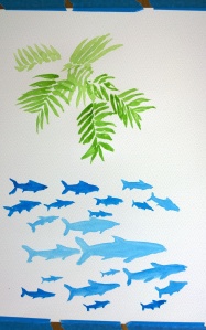
Reading the instructions, this exercise is about creating simple shapes, initially, without too many details, but some nonetheless.

Fish need to look like fish, so I thought the simple oval was not enough. Most of them seeem to me quite two-dimensional, even altering the saturation of the paint did not help much.

Leaves, also painted on the same sheet of A3, as instructed, feels more realistic, and actually the shape is as I had intended at first, just the simple long oval.

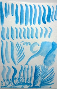
Painting, washing off and painting again (the post I made earlier about this seems to have disappeared so am posting it again)

  1. painting the leaves on dry paper the paint stayed more or less where I put it and it was relatively easy for me to estimate how much paint and colour I needed.
  2. washing off the paint was harder than I imagined, in the sense that the paint did not all wash off under the tap but had to be wiped off till the desired effect was reached.
  3. after the wash had been applied, working into the wet wash had a different quality. The paint was much more likely to seep into surrounding areas and appear darker than I had anticipated.
  4. painting on paper that is dry after it has received a wash feels somewhere between the two. Easier to control but somehow the paper seems more willing to absorb the paint and show off the colours.

The effects achieved by painting on wet paper are probably unique to watercolour. This feels unfamiliar at the moment, but I am looking forward to trying to find ways of maximising these effects to good use.

A3 Watercolour NOT 300g Sap green sable 10

A3 Watercolour NOT 300g
Sap green sable 10

A3 watercolour NOT 300g Sap green, washed off sable 10

A3 watercolour NOT 300g
Sap green, washed off
sable 10

A3 watercolour NOT 300g Sap green washed off Phthalo blue wash  Hooker's green squirrel 20, sable 10

A3 watercolour NOT 300g
Sap green washed off
Phthalo blue wash
Hooker’s green
squirrel 20, sable 10

A3 watercolour NOT 300g Sap green washed off Phthalo blue wash Hooker's green Sap green sable 10, squirrel 20

A3 watercolour NOT 300g
Sap green washed off
Phthalo blue wash
Hooker’s green
Sap green
sable 10, squirrel 20


Random marks

A3 Watercolour NOT 300g Permanent rose, sable 10 Cadmium orange, sable 6 Phthalo blue, squirrel 20

A3 Watercolour NOT 300g
Permanent rose, sable 10
Cadmium orange, sable 6
Phthalo blue, squirrel 20

Adding the pink first, spashing the page with coloured water, then drying with hairdryer.

We are meant to notice what is different, but the only thing I noticed was a lack of any substancial fading going on.

The same was true when I applied the orange, again splashing and drying. No fading, only minor colour variations.

Then the blue wash… well, if I had been missing my fading, here it was in all it’s glory! Fading, streaking, wishy washing all across the page in various amalgams of blue, pink and orange. Oops? No, I don’t think so, in fact, I think, this fading gives the image much greater dimensionality.

I can see families playing various ball games in the sea and on the shore!

Fading tones cont….

After the paint dried I have reapplied some brush marks.

A3 scrap watercolour NOT 300g permanent rose, sable 6 cadmium orange, sable 8

A3 scrap watercolour NOT 300g
permanent rose, sable 6
cadmium orange, sable 8

The most striking difference is in the power of absorption of the paper. Dry watercolour paper seems to show new brush marks far less readily than paper that has already received some paint or water. Adding another layer makes the colour suddenly far more intense as well as the brush mark much less clear, or well defined.

This seems to lend itself well to gradual fading, better than on dry paper.

However the colours underneath do ‘pollute’ the new colour applied. In my case the pink and orange made a very pretty peach/apricot colour. The photo actually distorts the colours, they are far less vivid when not seen through the lens.

I found the phthalo blue was a lot easier to control , not sure if that is because I prefer the larger brush size or perhaps it is just different colours, different effects. I will need to check in the next exercises.

Fading tones cont…

Looking at Elizabeth Blackadder on YouTube, how easily she applies the watercolour paint and how much nuance she achieves in just one brush stroke I continued to practice Fading tones, trying to achieve a variety of tones either immediately or upon reapplication of the paint.

It is surprising to me how much I can continue painting without having to add water or paint, perhaps this is due to the brush being quite large, size 10, and having a large holding capacity, whilst still allowing for gradual application.

In particular I have been learning to lift the brush at the end of the stroke so as not to end with a big blob as I had been doing initially.

This is quite satisfying, I am already starting to toy with the brush strokes I will want to use in leaves and fishes… and elephants ( I saw an ad for The Elephantom, a kids play with life size puppet blue elephants).

A4 watercolour NOT 300g Phthalo blue, sable 10

A4 watercolour NOT 300g
Phthalo blue, sable 10

Loading the brush and Fading tones

Loading the brush and Fading tones

Loading the brush and Fading tones

Loading the brush with lots of water made it very difficult to paint with any degree of accuracy, only very washy effects seemed to be possible.

Drying the brush and only dipping the tip made it easier to control but the colour was greatly reduced, so more colour would be needed.

Brushes filled with water but retaining a ‘point’ seemed to do the trick, a good amount of colour but varying thickness of line was possible.

Using a dry brush to soak up extra liquid is a good idea though I think using the tip of some absorbent paper may be just as effective.


The fading exercise was a little tricky initially as evidenced by the not so gradual fading of the pink colour, but I learned to dilute the colour with clear water and that seemed to have a more even effect as seen in the orange.