Category Archives: 1. Making A Start

Surfaces and Textures

Clingfilm

Watercolour exercise 10(7)

A4 Watercolour NOT 300 gsm, Purple Lake mixed with Viridian, sable brush 10, clingfilm. Really enjoyed the outcome of this.
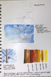
Salt crystals

Watercolour exercise 10(7d)

A4 as the other two, this is Alizarin Crimson mixed with Viridian and all three textures are applied to the one painting. Salt is in the foreground, the trees and the fence are made using a craft knife and the trees in the back are scraped and also made with cling film. The tonality is not right, I feel the fence should be lighter and the back darker in areas, I may yet try to alter those, but this shows the different techniques to good effect, I think.

Watercolour exercise 10(7d.)

Image as above with changes: washed off some of the fence and the trees in the foreground, added another layer of clingfilm effect to the background and when dry, picked out some of the detail.


Scarifying, scraping and texturing

Watercolour exercise 10(7c)

A4 Watercolour NOT 300gsm, Alizarin Crimson and Viridian, sable brush 10, sand paper and craft knife. This technique seems to add movement to a painting.

Other tools for watercolour

Blotting and wiping

Covered a sheet of A4 watercolour NOT 300g paper in an even layer of blue paint, still using the mixture of Purple Lake and Viridian which can blend to a phthalo-like shade of blue.

Then, while the paint was still wet and using a dry sponge I tried to make a cloud effect in the top half, as instructed… to not much effect, it has to be said, so I soaked the sponge in water and that had the desired effect.

Watercolour exercise 10(6)

After the paint had dried I added another layer of blue, having added more of the same two pigments to my prepared mixture, to create a kind of seascape. We are advised to continue in this manner, adding more layers to create, eventually, a dark blue seascape with ‘drammatic clouds’.

Watercolour exercise 10(7)

To my mind, this is very satisfying! The above image is with two layers, I will add more in due course.

Watercolour exercise 10(6c)

Watercolour exercise 10(6d)

And a final deep coat of blue…

Watercolour exercise 10(6e)

Making marks in different ways

Exercise: Unusual brush marks

Trying a few marks with a toothbrush, a dish washing brush, and a size 30 decorator brush on a piece of A4 NOT watercolour paper, the marks took quite well, though I had to try and work out how to hold the brushes, as obviously they were not being used in the usual way, in order to make a mark that was different but felt authentic with regard to the brush I was using.

Watercolour exercise 10(1) Watercolour exercise 10(2)

I wanted a quick refernce to the marks I had made in my sketchbook but found that the smoother paper did not have the same result at all! (see sketchbook 1; 19) So it is not only the choice of brush but even a small change in the grain of the paper makes a big difference.

(edit – image removed)

Exercise: Using various brushes

First covered a sheet of A4 watercolour paper with marks made by toothbrush and using up the old paint I had mixed for the previous project, Purple Lake and Viridian, mixed to various degrees.

Watercolour exercise 10(4)

We are asked to lift off half the paint with a dry paper towel, that creates some nice variation. Here the lower half has been treated that way.

Then I soaked an A4 watercolour NOT 300 g paper in water for a few minutes until it was totally soaked through, dried it a little and, using the same colours again but this time with a dish washing brush made marks all across the page.

Watercolour exercise 10(3)

I then lifted off the paint over half the page with a dry towel. It can be clearly seen that the effect of this is drastically different when the paper was wet to begin with!

Masking fluid

Masking fluid is a wonderful addition to the repertoire of the watercolourist!  Much as I love to see what the paint does of its own volition it is nice to have a sense that I am actually able to control where the colour goes. All the excercises do that to some extent but the masking fluid is especially satisfying because you can add it, take it away, paint a different pattern, add some more…. and the removal of the fluid once dry is satisfying in itself, once you get the hang of it! (see Sketchbook 1; 16-18).


Lines with wax

started with a little sketch of the outlines (in sketchbook)

sketchbook 01014 ii

tried various ideas to see what would look effective

sketchbook 01014 iii

here the tree is like a negative; in the second one the lines are not in wax, though they do resist in a different way as they are waterproof.

sketchbook 01015

again the clouds are not strictly lines, they did look like lines originally but the wash did away with that notion. The white crayon is both whiter but less waterproof than the candle. Because it is white and can be seen more easily I applied less pressure and so it appears more transparent.

the black crayon I purposefully left grainy as I wanted to see if the wash would still take. It does, though the degree to which it does depends on a number of factors including the paint colour, quality etc.

Reserved shapes from resists

Plain areas with wax


Watercolour exercise 08

The colours are distorted again. It makes me wonder whether it is usual for watercolours to be ‘misrepresented’ in photographs. Must investigate… also if there is a way to correct this.

Patterns with wax

Watercolour exercise 09

In my sketchbook, applied Cadmium red, then wax, then Purple Lake. This is fun! Seems to me there is no right or wrong and I like the surprise reveal when the paint goes on.

Laying washes

Plain washes   Applied a simple wash of Paynes grey and when dry painted on a simple bird shape. Very simple but I think this can be very effective.

watercolour NOT 300g Paynes grey squirrel 20 sable 02

watercolour NOT 300g
Paynes grey
squirrel 20
sable 02

Tonally graded washes The title says it all. I found it a challenge to create an effective wash. The instructions made it sound so simple, just add more water so the wash is diluted, but with the large brush that was not working out. Maybe my brush was too large, especially because my paints are in half pan sizes. This may be easier to do with paint out of a tube where you can regulate much more easily how much paint you are adding. With the half pan I really cannot tell how much is being picked up by the brush at each time. Perhaps it is also not helped by my lack of experience. In the toned version I did not proceed gradually down, but tried to make it look gradual all the same.

watercolour NOT 300g Yellow ochre squirrel 20

watercolour NOT 300g
Yellow ochre
squirrel 20

Mixed colour washes  Am finding it a challenge to mix the colours appropriately. My brush soaks up an inordinate amount of paint and water, but does not then deposit it on the paper, so I cannot tell what colour it is?! That said I did enjoy mixing the colours and the slightly watery effects achieved where the different hues merge and blend.

watercolour NOT 300g Cerulean and Ultramarine squirrel 20

watercolour NOT 300g
Cerulean and Ultramarine
squirrel 20

This is to show the paper where all three exercises were applied.

A3 watercolour NOT 300g Paynes grey, Yellow ochre, Cerulean, Ultramarine squirrel 20, sable 02

A3 watercolour NOT 300g
Paynes grey, Yellow ochre, Cerulean, Ultramarine
squirrel 20, sable 02

Fishes and leaves

A3 watercolour NOT 300g Phthalo blue green Sap green sable 10

A3 watercolour NOT 300g
Phthalo blue green
Sap green
sable 10

Reading the instructions, this exercise is about creating simple shapes, initially, without too many details, but some nonetheless.

Fish need to look like fish, so I thought the simple oval was not enough. Most of them seeem to me quite two-dimensional, even altering the saturation of the paint did not help much.

Leaves, also painted on the same sheet of A3, as instructed, feels more realistic, and actually the shape is as I had intended at first, just the simple long oval.

Painting, washing off and painting again (the post I made earlier about this seems to have disappeared so am posting it again)

  1. painting the leaves on dry paper the paint stayed more or less where I put it and it was relatively easy for me to estimate how much paint and colour I needed.
  2. washing off the paint was harder than I imagined, in the sense that the paint did not all wash off under the tap but had to be wiped off till the desired effect was reached.
  3. after the wash had been applied, working into the wet wash had a different quality. The paint was much more likely to seep into surrounding areas and appear darker than I had anticipated.
  4. painting on paper that is dry after it has received a wash feels somewhere between the two. Easier to control but somehow the paper seems more willing to absorb the paint and show off the colours.

The effects achieved by painting on wet paper are probably unique to watercolour. This feels unfamiliar at the moment, but I am looking forward to trying to find ways of maximising these effects to good use.

A3 Watercolour NOT 300g Sap green sable 10

A3 Watercolour NOT 300g
Sap green sable 10

A3 watercolour NOT 300g Sap green, washed off sable 10

A3 watercolour NOT 300g
Sap green, washed off
sable 10

A3 watercolour NOT 300g Sap green washed off Phthalo blue wash  Hooker's green squirrel 20, sable 10

A3 watercolour NOT 300g
Sap green washed off
Phthalo blue wash
Hooker’s green
squirrel 20, sable 10

A3 watercolour NOT 300g Sap green washed off Phthalo blue wash Hooker's green Sap green sable 10, squirrel 20

A3 watercolour NOT 300g
Sap green washed off
Phthalo blue wash
Hooker’s green
Sap green
sable 10, squirrel 20


Random marks

A3 Watercolour NOT 300g Permanent rose, sable 10 Cadmium orange, sable 6 Phthalo blue, squirrel 20

A3 Watercolour NOT 300g
Permanent rose, sable 10
Cadmium orange, sable 6
Phthalo blue, squirrel 20

Adding the pink first, spashing the page with coloured water, then drying with hairdryer.

We are meant to notice what is different, but the only thing I noticed was a lack of any substancial fading going on.

The same was true when I applied the orange, again splashing and drying. No fading, only minor colour variations.

Then the blue wash… well, if I had been missing my fading, here it was in all it’s glory! Fading, streaking, wishy washing all across the page in various amalgams of blue, pink and orange. Oops? No, I don’t think so, in fact, I think, this fading gives the image much greater dimensionality.

I can see families playing various ball games in the sea and on the shore!

Fading tones cont….

After the paint dried I have reapplied some brush marks.

A3 scrap watercolour NOT 300g permanent rose, sable 6 cadmium orange, sable 8

A3 scrap watercolour NOT 300g
permanent rose, sable 6
cadmium orange, sable 8

The most striking difference is in the power of absorption of the paper. Dry watercolour paper seems to show new brush marks far less readily than paper that has already received some paint or water. Adding another layer makes the colour suddenly far more intense as well as the brush mark much less clear, or well defined.

This seems to lend itself well to gradual fading, better than on dry paper.

However the colours underneath do ‘pollute’ the new colour applied. In my case the pink and orange made a very pretty peach/apricot colour. The photo actually distorts the colours, they are far less vivid when not seen through the lens.

I found the phthalo blue was a lot easier to control , not sure if that is because I prefer the larger brush size or perhaps it is just different colours, different effects. I will need to check in the next exercises.