Category Archives: 2. Painting From Observation

Colour (cont..)

Warm and cold colours

Watercolour exercises 15 (5) Watercolour exercises 15 (6) Watercolour exercises 15 (7)

Watercolour exercises 15 (8) Watercolour exercises 15 (9) Watercolour exercises 15 (10)

Quick sketches to explore colour. Three citrus (seen at time of painting); sunrise, sunset and holly (from memory);  for colours used see sketchbook 1, 34-35; all on one sheet of watercolour NOT, 140lb, 30″x22″  (6 of 9 sections) see below.

Watercolour exercises 15 and 12


Colour

Still life with colourful objects

Watercolour exercises 15 (3)

Colourful objects using complementary colours and also different shades of one colour.   Blue cloth (ultramarine and cobalt blue), Green pillow (sap green, yellow ochre and burnt umber) Yellow chicken dish (the yellow for the banana, red for the apple, sap green and cadmium orange), Yellow banana (cadmium yellow, lemon yellow and burnt umber) Red apple ( Cadmium red-orange, purple lake and some of the green and yellow).


Tone and composition (cont..)

Dramatic interior ..

Watercolour exercises 14(17)

The exercise required a view through a door. I continued to use Payne’s grey for the realistic views, and Viridian with Alizarin Crimson for the imaginary ones. I think Payne’s grey has a more grounded feel to it than the latter, which to me expresses better a slightly unreal atmosphere.

Imaginary rooms ..

Watercolour exercises 14(18)

We had to choose a different kind of room, like a castle; I chose the stage/auditorium of an opera house.

Tone and composition (cont)

Dramatic interiors

Watercolour exercises 14 (11)

We are meant to paint a view with an open door and I just realised I ‘removed’ the door from behind the chair as it was getting too complicated with all the diagonals. Especially with the two night view paintings I found the paint was leaving a lot of watermarks, and where lots of layers were added to make the tone darker, sometimes the brush takes away pigment rather than deposit it!

Watercolour exercises 14 (6)

Watercolour exercises 14 (12)

All the tone and composition images are on a 30″x22″ watercolour NOT 140 lb paper divided into 9 sections about A5 size, mostly in Payne’s grey. (below)

Watercolour exercises 14

Imaginary Rooms

Watercolour exercises 14 (10)

Watercolour exercises 14 (9)

The imaginary room is done in Alizarin Crimson and Viridian. Having done the other paintings first really helped to imagine where the lights would fall and how to manage the various shades. I think there is likely to be much less detail when it is imagined.

Vast expanses of one colour seem to create strange lines or creases or shadows. Sometimes they can be a pleasant addition, but on other occasions they are not. I’m sure watercolour has much potential for conveying mood and atmosphere


Drawing and watercolour continued

Pencil and watercolour

Watercolour exercises 12 (1)

Watercolour exercises 12 (2)

Watercolour exercises 12 (3)

The leaves of Nandina domestica and the flowers of Hedera helix.  All three are done on the lower third of a 30″x22″ watercolour NOT 140lb paper. [see ‘Colour (cont..)’ for view of whole paper] Having done the quick sketches of fruit and vegetables without pencil outlines on the painting (though I did do studies in pencil in my sketchbook before attempting the sketches), here we are instructed to use pencil. In the first instance to follow the pencil lines quite carefully and in the second to just use them as vague guides. The third does not use pencil, but ink instead. I did the painting first and highlighted it with the ink.


Drawing and watercolour

Quick watercolour studies (cont.)

I enjoyed doing these exercises. The small size means you do not have to spend a great deal of time on each one, although I did spend quite some time on the drawings which are in the sketchbook. I find those help me look at tone, line and texture without having to think about colour.

Painting without following a line of a pencil was new for me and I enjoyed the freedom it gives.

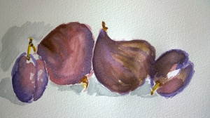
We were asked to keep the colours clear, that is, not mixing too many colours together and in the last exercise with the plums it is apparent why. In the first one, at the top, I used the colours quite pure, but as I tried to make them darker I mixed them and in the third one at the bottom it shows as the colours are quite ‘muddy’ and a lot less vibrant.

The line drawings were fun to do, it was like drawing with a brush rather than painting, and I am glad I kept the studies of line and tone separate as in the one with the grapes I tried them together and did not feel it was as successful. I find it easier to concentrate on one thing at a time.

All the quick watercolour studies were done on 22″x30″ watercolour NOT 140lb

Watercolour exercises 11

Same as below, continuing with studies on how to express tone, line and texture in watercolours. I wanted to try some really dark colours, again very similar. Alizarin Crimson with Ultramarine, Purple Lake with Burnt Umber and Cad Orange with Emerald. I found that I needed to combine more or less all of them to get the colours I wanted.

Watercolour exercise 11(7)

Watercolour exercise 11(8)

Watercolour exercise 11(9)

This time I remembered to add some shadows, it makes a big difference I think. The mix is Viridian and Alizarin Crimson.


Drawing and watercolour (cont.)

Quick watercolour sketches continued

I thought I would try some fruits of similar colours, so have a peach, a plum and some grapes. Have prepared three colours, Purple Lake with Burnt Umber for the darker areas, Cadmium Orange with Emerald for the lighter areas and just Alizarin Crimson.

Watercolour exercise 11(4)

We are asked to focus on tone, line and surface texture. In this one I focused on tone.

Watercolour exercise 11(5)

This was going to be about texture, but I liked it like this and it looks quite linear, the line here being white.

Watercolour exercise 11(6)

This is also linear but with a little sponging for texture.